Evidence · Dental clinic · 8 practices verified live
What the best dental websites do in 2026
The short answer
The best dental websites in 2026 do two things at once: they calm an anxious patient within seconds, and they make booking the easiest action on the page. Everything else — one answer-shaped page per treatment, named dentists with real credentials, plain insurance and cost information, a visible emergency path — exists to serve those two jobs. Below, each practice is checked against a live template built to prove it.
By Nikolai Bhend · Verified against the live template · Updated September 2, 2026
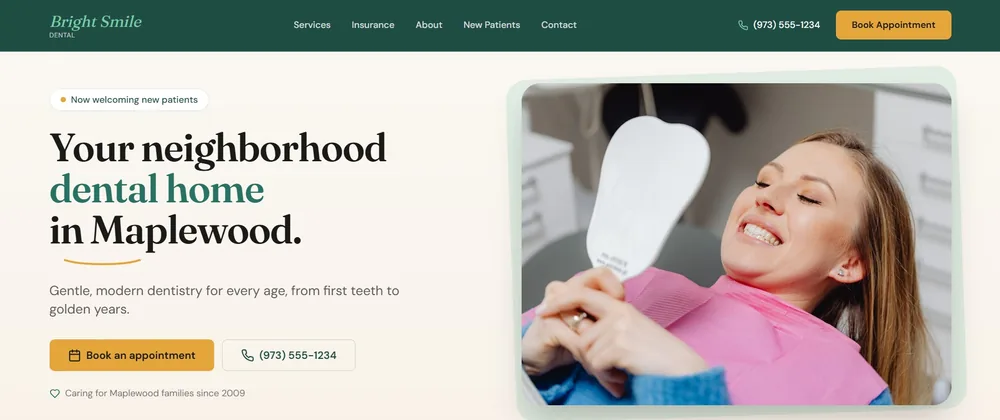
Bright Smile Dental — the dental clinic template behind this page, a fictional business in Maplewood, NJ, running live at dentist.horizonstemplates.com. Every claim below was checked on it.
The 8 practices, verified live
What the category leaders ship, and where this template proves each one. Each card jumps to the detail.
- 01One page per treatment, written to answer the question the patient searchedVerified live
- 02Booking is one tap away at every scroll depthVerified live
- 03A visible emergency path, separate from routine bookingVerified live
- 04Named dentists, real credentials, real facesVerified live
- 05Insurance and money answered plainlyVerified live
- 06Calm design that passes the half-second test — on a phoneVerified live
- 07Reviews and before-and-after photos only when they are real and consentedVerified live
- 08One consistent local identity, on the page and in the dataVerified live
- 01
One page per treatment, written to answer the question the patient searched
What the best dental sites do
The practices that rank and get quoted give every treatment its own long page — typically 800 words or more — with the treatment and the city in the headline, question-shaped subheadings, a direct answer in the first paragraph, then what to expect, aftercare and honest cost factors. Thin “services” lists lose to that structure on every query that matters, including the “how much does X cost” searches patients actually type.
What Bright Smile Dental ships · verified live
Bright Smile Dental builds each treatment page in that answer shape: direct answer first, then what to expect, who it is for, and the cost factors that genuinely vary — so a nervous reader knows what happens next before being asked to book.
Open Bright Smile DentalMake it yours
Your treatments, your city in each headline, your real cost ranges.
- 02
Booking is one tap away at every scroll depth
What the best dental sites do
Leading practice sites let a patient book the moment they decide — including at 9pm — with a persistent booking control on every page and a mobile bar that stays in reach. “Call us during opening hours” quietly loses the after-hours majority of decisions.
What Bright Smile Dental ships · verified live
The template keeps the appointment one thumb-tap away with a mobile sticky booking bar built into the header, and treats booking as a single consistent action across the site: connect your scheduler once and the hero button, every page CTA and the sticky bar all update together. Until then, the demo path works end to end with a clean confirmation state.
See the sticky booking bar on mobileMake it yours
Point the booking action at your scheduling platform.
- 03
A visible emergency path, separate from routine booking
What the best dental sites do
Best-in-class practices give emergencies their own route from the home page — phone number first, then what to do until you reach us — because someone with a broken tooth needs a different next step from someone scheduling a cleaning, and hunts for it under stress.
What Bright Smile Dental ships · verified live
Emergency care has its own visible path from the home page and is deliberately separated from routine booking, so a patient in pain is never left digging through a services menu.
Find the emergency path on the demoMake it yours
Your emergency line and after-hours policy.
- 04
Named dentists, real credentials, real faces
What the best dental sites do
Patients check who will be working on them. The strongest sites name each dentist with their qualification, attribute treatment pages to a specific provider, and use photography of the actual team — a measured conversion driver — while stock faces posing as staff read as fake even when nobody can say why.
What Bright Smile Dental ships · verified live
The template ships named provider slots with credential placeholders and portraits that carry a visible “Sample photo” badge on the image itself until you replace them with consented headshots — no stock face is ever presented as your team. Nothing on it claims to be a real person until you make it one.
See the team sectionMake it yours
Your dentists, their DDS/DMD credentials, consented photos.
- 05
Insurance and money answered plainly
What the best dental sites do
A page that lists accepted plans, explains financing and gives honest cost ranges removes the second-biggest reason patients stall. The leaders publish it; most practices bury it or leave it to the phone call.
What Bright Smile Dental ships · verified live
Bright Smile Dental pairs plain answers about insurance with honest cost factors on each treatment page, so the money question is answered where it is asked instead of deferred to reception.
Read the insurance answers on the demoMake it yours
Your accepted plans, your financing partner, your ranges.
- 06
Calm design that passes the half-second test — on a phone
What the best dental sites do
Patients form an impression of clinical quality from the site almost instantly, and most “dentist near me” searches happen on a phone. The best sites are calm, uncluttered, fast, and keep the booking action clear above the fold with nothing competing for attention.
What Bright Smile Dental ships · verified live
The template is mobile-first and deliberately lightweight, with a locked design-token system and a fluid type scale — a whole-site reskin is a palette-and-name change in one file, and every page, state and focus ring follows.
Open the demo on your phoneMake it yours
Your palette and practice name — one file.
- 07
Reviews and before-and-after photos only when they are real and consented
What the best dental sites do
Leaders show verified reviews through the platforms that verify them and publish before-and-after images only with written patient consent. Fabricated stars and stock “results” are the fastest way to lose both patient trust and search visibility.
What Bright Smile Dental ships · verified live
The template ships a labelled, empty slot for reviews, and before-and-after sliders whose sample images carry a visible “Sample” badge until you add real, consented cases. It carries no invented testimonials and no fabricated rating markup.
See the swap-me proof slotsMake it yours
Your verified reviews, your consented case photos.
- 08
One consistent local identity, on the page and in the data
What the best dental sites do
Name, address, phone and hours match exactly across the site, the business profile and directories, and the site carries structured data for the practice — its type, location and hours — plus the answer-shaped FAQs engines quote. Inconsistency here is a silent ranking tax.
What Bright Smile Dental ships · verified live
Bright Smile Dental publishes real hours and location as visible content and as structured data for the practice, with answer-shaped FAQs on its pages — the details patients actually check, kept consistent from one source.
Check the footer and contact detailsMake it yours
Your practice name, address, phone and hours — once.
Bright Smile Dental · Maplewood, NJ
See every practice live: Bright Smile Dental
The dental template behind this page ships each practice above as a working, audited build — walk the real thing, then make it yours. Cloning is free; publishing needs a Hostinger Horizons plan.
Questions people ask
Two things: they lower anxiety and they make booking effortless. Concretely that means one answer-shaped page per treatment, booking within one tap at every scroll depth, a separate emergency path, named dentists with credentials, plain insurance and cost information, and a calm, fast mobile experience. Everything decorative is secondary to those.
Yes. A large share of booking decisions happens outside office hours, and a site that only says “call us” loses them. Online scheduling that is reachable the moment a patient decides — including from a mobile sticky bar — measurably outperforms phone-only booking.
Only when they are real and consented. Verified reviews through the platforms that verify them are a strong signal; fabricated ratings or stock “results” photos damage trust and can breach advertising rules. A good template gives you the slots and keeps them empty until you have the material.
Enough to answer the whole question: what the treatment is, who it is for, what to expect, aftercare and honest cost factors — usually 800 words or more, structured under question-shaped headings with the direct answer first. That structure is what ranks and what AI search quotes.
More evidence pages
- Law firmWhat the best law firm websites do
- PlumbingWhat the best plumbing websites do
- Insurance agencyWhat the best insurance websites do
- Real estateWhat the best real estate websites do
- Café / roasteryWhat the best café websites do
- RestaurantWhat the best restaurant websites do
- Med spaWhat the best med spa websites do
- AccountingWhat the best accounting websites do
- Hair salonWhat the best hair salon websites do